Last Friday, I announced a couple new programs that I was starting: 24-7 Ink Rewards, Free Catalogs and using a Host Code on your online orders. As I mentioned these items are exclusive to me and cannot be redeemed through other Demonstrators. The details for each Program is listed in the links across the top of my page.
Well, Stampin Up just announced they are offering a special for July. For every $50 USD you spend (pre-tax and shipping) between July 7 and July 31, you’ll get a $5 USD Bonus Days coupon that you can use between August 2–31, 2016. This is a great opportunity for you to get items from your wish list, whether you buy them now or with your coupons in August. This is the very first time Stampin Up has offered this type of promotion. If you haven’t placed your order yet this week, hold out til Thursday to get the $5 coupon code.

Details
- An email address is required to participate in this promotion; Bonus Days coupon codes can only be delivered to participants via email.
- We strongly recommend that participants both save emails containing their Bonus Days coupon codes AND write down the coupon codes in a safe place—the codes cannot be resent if the participant loses the email. Stampin Up cannot recover lost codes.
- Participants will receive a $5 USD Bonus Days coupon code via email for every $50 USD they spend in a single order (pre-tax and shipping). There is no limit to the number of coupons you can receive per order or throughout the duration of the promotion. There is no limit on the number of coupons you can use on an order during redemption.
- Bonus Days coupons codes can be used in the checkout process during the redemption period.
- Bonus Days coupon codes can be redeemed for any product, excluding Starter Kits and Paper Pumpkin subscriptions. New prepaid Paper Pumpkin codes can be redeemed.
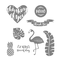
Today’s feature uses the Pop of Paradise stamp set. Pineapples and flamingos are so popular right now. Let me tell you, I could really use some paradise right now. Our fridge died this past Sunday and the new one won’t be here until next Sunday. A whole week with no fridge. Usually, I love any excuse to not have to cook dinner because it means more time to craft. However, not for an entire week. I am so thankful to have such a generous friend and neighbor willing to share her fridge with me. The week can’t get any worse, can it? (Did I just jinx myself?) Anyway, moving on!
Pop of Paradise… I don’t know which I like more, the pineapple or the flamingo. For this card, the flamingo won out. I do have a bunch of pineapples cut out, so you will very likely be seeing a pineapple card in the very near future.
I really wanted to use a number of images from this set. They all work together so well. Originally, I started with stamping and masking off images, but it just didn’t have the look I wanted. Instead I changed it to stamping and cutting out images and then layering. That definitely gave me a cleaner look.
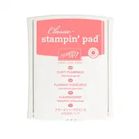
To get the black flamingo’s beak, I stamped the entire image in Flirty Flamingo (of course) and then I colored the beak with my Basic Black marker. The eye is black as well. That Flirty Flamingo color is just perfect for flamingos.
A couple tips about the card.
- Notice that I stamped a “ground” for the bird. This improves the overall image of the card because you don’t have images that look like they were just stamped in the middle of a card.
- I took the time to cut out the space between the bird’s legs. I probably could have skipped it but I felt it was worth the extra minute or two to help with the illusion that the bird is separate from the background.
- When you’re not sure where to put your sentiment or ribbon, group it all together, even layering it with your focal image.
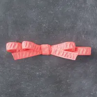
- Have a color you want to use, but it’s a really bright color? I used just a little bit of the Flirty Flamingo ribbon. If I had used more of the ribbon, it would have pulled your attention away from the focal image because of the brightness of the color.
- Remember your color tones. If you’re working with bright colors, try not to overwhelm people with too much of it. Leave enough white space on your card that the viewer’s eyes can rest. It sounds silly, but this is so true. Most people need that white space “rest” or it’s too chaotic for them.
- The card base color for this card is actually Flirty Flamingo. I just realized that you can’t see that though and I didn’t take a picture of it (oops). On the inside, I do have a panel of Whisper White for the sentiment.
I’m dreaming of being in paradise, rather than thinking about the dead fridge in my kitchen. I would so love to be on vacation this week. For now, I’ll just picture myself lounging in that hammock by the beach, sipping my Mai Tai out of a pineapple… sounds pretty good, doesn’t it?

Thank you!