This past April, I was fortunate to be selected to be an OnStage Display Stamper. What does it mean to be selected to be a Display Stamper? It means that I was selected to make projects that were up on display for all the Demonstrators to see at the OnStage Live Event in Salt Lake City. This would be the first time other demonstrators would be seeing new products being used. It was a totally amazing experience and I was thrilled to be selected.
Let me give you a little background into the process. In the Weekly Updates for Demonstrators, Stampin Up puts out a call to apply to be a Display Stamper. You furiously make the projects they request so you can apply. Then you remake two of them because they didn’t turn out the way you wanted. Then you tweak a third because it might not be up to snuff. And now you’re out of time and have to get it submitted the way it is.
Then you anxiously wait by your phone and email because you’re not sure how they’ll contact you since you’ve never done this before. I was amazed and floored when I got the email that started with “Congratulations! Based on your project submissions, you have been selected…”. Oh my goodness! I couldn’t believe it! All at once the feeling of excitement and fear, sort of like riding a roller coaster.
Once you fill out the paperwork and officially agree to be a Display Stamper, they send you instructions on what your focus will be. My instructions were to make 20 (!!) projects using the 2015-17 In Colors and it should be a combination of 3-D, scrapbook, and cards. How many of each was totally up to me. I calculated that I needed four “things” per color and wanted to make one 3-D and one scrapbook page per color, which then left two cards per color (yes, I’m a little OCD that way).
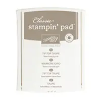
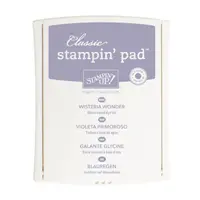
Today I’m sharing my Tip Top Taupe projects. I have to be honest, I don’t think I’d used my Tip Top Taupe pad very much until this assignment. I’m glad I got to know it better. Taupe is an awesome neutral color and pairs really well with lots of colors.
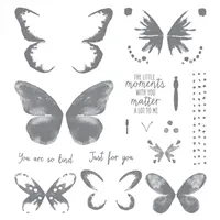
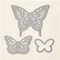
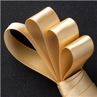
This first item is my 3-D project. Have you seen those picture frames where they mount real butterflies to preserve them? I did my own version with paper butterflies. I found this amazing distressed frame which perfectly coordinated with the Basic Black and Tip Top Taupe colors. I love our Watercolor Wings stamp set and Butterflies Thinlets. And the Gold Satin Ribbon is the perfect touch.

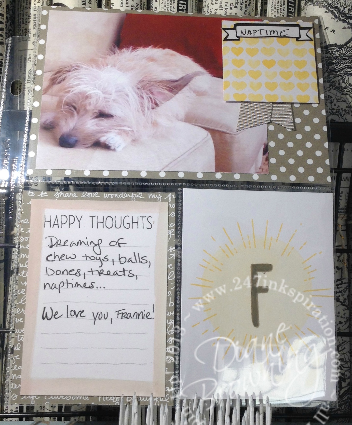
My second project is my scrapbook page. If you’ve read some of my other posts, you know I love Project Life. This product has made my life so much easier. I’m back to getting our pictures in albums rather than letting them sit on our computers and phones.
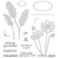
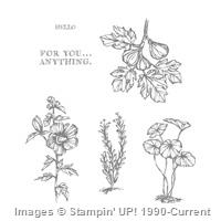
And now for my two cards. The Helping Me Grow stamp set was not one of the sets that immediately grabbed my attention when I first saw it in the Occasions Catalog. It has two flower images and some sentiments. The more I kept looking at it though, I thought the flowers would be great for practicing my watercoloring skills. And it does look amazing with the two different colors.

For the second card, I used the Fabulous Flora Hostess stamp set. All of the images in this set look fabulous watercolored. I used the In Color DSP to give the card one more layer. I love the Taupe and White flower pattern, but the White was a lot of white. I stamped the Watercolor Wash in Taupe across the pattern paper to tone down the White.

I hope you enjoyed this first group of projects. I enjoyed the whole process and would certainly do it again. I’ll share another group of projects very soon.


Leave a Reply