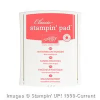
One of my favorite things about summer is fresh watermelon. There is just something about that sweet juicy fruit that brings to mind picnics, pool days, and warm evenings. Stampin Up has this habit of naming their colors after foods and Watermelon Wonder is no exception. Every time I see that color, I remember being a kid, wrapped in a towel sitting pool side with my cousins, while my mom passes out the watermelon slices. We certainly didn’t worry about being messy, because we were just going to get right back in the pool.
It’s funny how we associate colors and foods with special memories. When I see the color Watermelon Wonder, it makes me smile remembering those carefree days. Today I’m sharing a second group of projects that I made for the Displays at OnStage last April. These are the projects showcasing the color Watermelon Wonder.
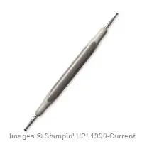
First up is my 3-D project, which is a 6×6 canvas that’s 2″ thick. These chunky canvases are really kind of neat. You don’t really need a picture frame with them. I’ll tell you a little secret about this canvas. This is actually the second one that I made. The first one didn’t turn out like I’d hoped and the more I tried to fix it, the worse it was. Sometimes that’s just how it goes. The easiest way to “fix” it was to cover it entirely in the Watermelon Wonder pattern paper. And voila! This looks so much better. The flowers in the center are watercolored and layered to give it added dimension. I used my stylus from the Simply Scored to shape the white flowers so they look more like real flowers. The sentiment is from the Love & Affection stamp set. It is such a lovely greeting for a friend. 
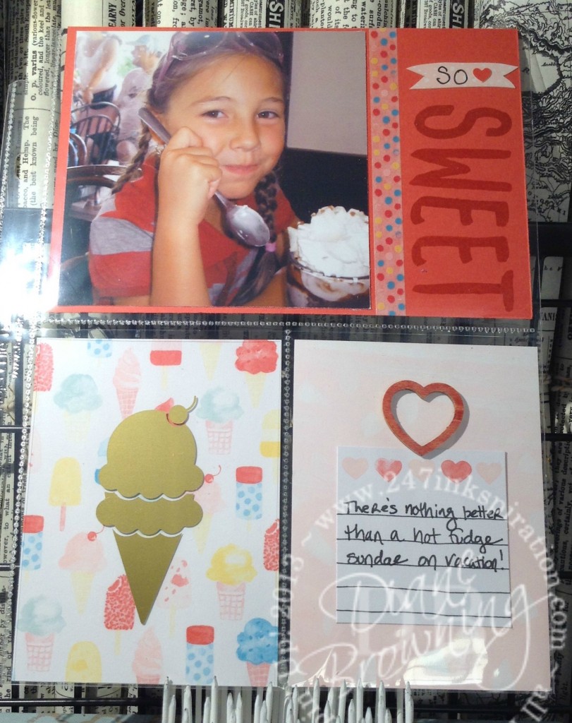
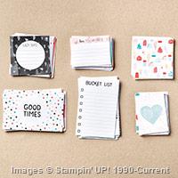
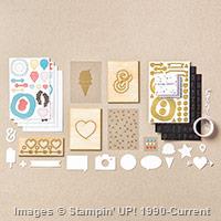
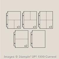
The next item in my scrapbook page, which is in a Project Life format with the pocket pages. These pages go together so quick because your focus is on the pictures and you just fit in the Project Life cards around the pictures. Then add a couple embellishments, and you’re done. I love this picture of my daughter with her pink sun-kissed cheeks, sunglasses, and a giant ice cream sundae.
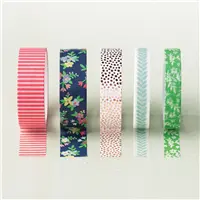
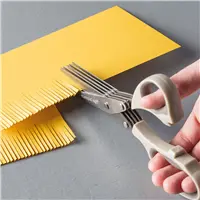
The flowers on the next card are from the Love & Affection stamp set. This set does not have a coordinating punch or dies. So yes, you have to cut out the flowers yourself. I used my fringe scissors to cut out the layers at the bottom. If you do this yourself, make sure to cut your layers to the same depth, leaving room at the top so you have a way to glue it down. I glued the layers starting at the bottom of the card and then worked my way up. Adding the washi tape strip at the top helps to hide any goofs in the cutting with the fringe scissors. 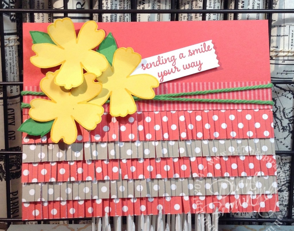
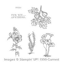
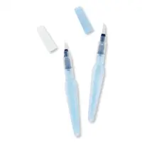
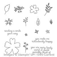
Fabulous Flora is a Host Stamp Set. This is a great stamp set for watercoloring. Lots of different choices for the flowers and leaves and they all look great in a number of colors. The stems on these flowers is very thin. I just colored them in very slowly using my aqua painter with a very light touch. If you press down too heavy, you won’t stay in the lines. Just like my Tip Top Taupe card from last week, I used the Watercolor Wash background stamp to tone down all the white flowers in the pattern paper.
When you see certain colors does it remind you of past memories too? Every time I think about the color Early Espresso, I can almost smell the coffee brewing. The color Chocolate Chip makes me think of cookies or muffins. Mint Macaron reminds me cafes in Paris. Which Stampin Up color is your favorite? What does it remind you of? I’d love to hear your thoughts on these colors too!



Leave a Reply