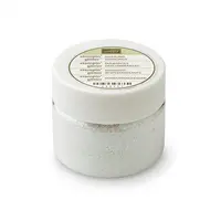
A few weeks ago I shared this post here where we tried to make our own texture paste at one of our Downline Meetings. Here’s a quick look at that card again. Some were slightly better than others, but most of them were similar to this.
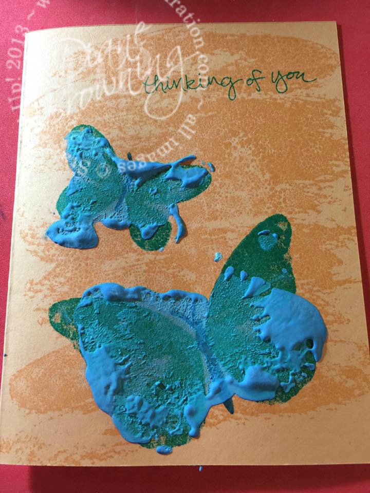
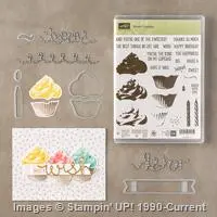
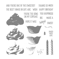
I promised that I would revisit this technique and see if I could get better results. Lyndi and I got together to give it a try using the same exact stamp set that Sara Douglass used in her sample. We weren’t sure if the splotchiness of the butterfly stamp was due to the stamp itself (too detailed) or if we just didn’t have the technique right.
We stamped bunches of cupcakes so we’d have plenty to work with. Then we die cut all the cupcake toppers. Taking a little bit of the texture paste, we smeared it onto a large clear acrylic stamp block. Then “inked” our stamp with the texture paste. We tried both more paste and then less paste. Essentially, most of them ended up looking like this. Kind of clumpy.
To be honest, we were both a little disappointed in the results. We were pretty sure we’d followed the directions. But we still ended up with largely the same results as we’d had with the butterfly stamp. Ok, maybe not quite that bad, but it wasn’t what we’d hoped for.
So what now? We literally had a couple dozen cupcake toppers but we didn’t want to waste them by stamping the texture paste, which we just couldn’t seem to get right. My daughter Maddie, who loves to paint, happened to be working in the studio with us and suggested we instead paint the texture paste on. Oh my goodness! What a difference! Check out this beautiful cupcake!
She just added the swirls of paste where the stamping would have been. Then we sprinkled Dazzling Diamonds glitter all over it and set it aside to dry. Amazing! It came out exactly like we’d hoped.
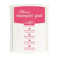
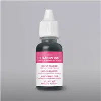
Here are a couple cards that I made out of some of the cupcakes. The first uses a Melon Mambo texture paste.
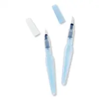
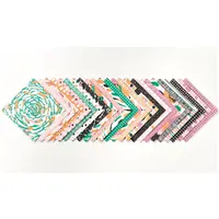
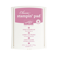
This second card uses Sweet Sugarplum texture paste. The only pattern paper I had on hand with Sweet Sugarplum happens to be the Playful Palette DSP, which has Very Vanilla in it and not Whisper White. I did have to watercolor a new sheet of Very Vanilla after I realized the White did not match.  To get the colored background, I used my Aquapainter, dipped it in the ink, and then just brushed it across the front of the card. I did note that more water gave a smoother look on the card. Less water made it look more like a “dry brush” technique without the smooth rounded edges.
So, is this a failure or not? We couldn’t get the results we wanted by stamping it. But we did end up with some awesome cupcakes by painting the paste on. I happen to have a little bit of the paste left over, so you might see something else with it in the near future.
If you follow me on Instagram, you would have seen my sneak peak for Wednesday’s post. It includes a couple snowmen and a tree. I can assure you that you definitely want to see the finished result of this project. It turned out pretty incredible! Don’t forget to come back Wednesday!


Love it! Definite success!
Thanks Lynda!